
This table is derived from the Irish Life Tables 2001-2003. (CSO) Double-click on the image to get a full view.
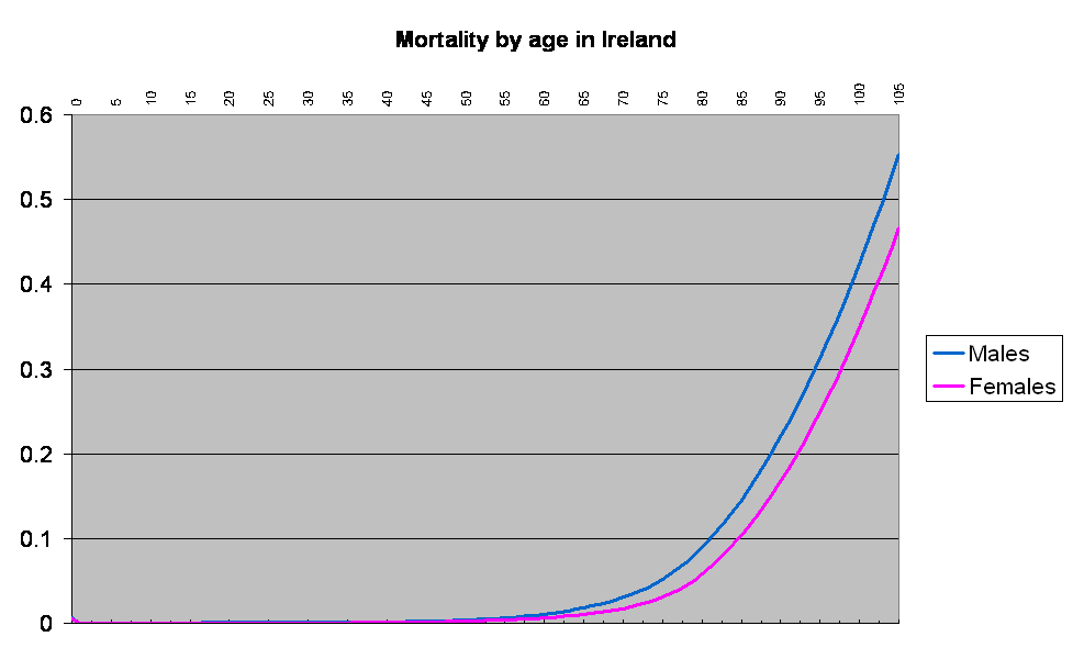
It’s a logarithmic graph of your likelihood of dying at any particular age, from birth right up to the ripe old age of 105.
Maybe it’s just me, but I find it fascinating. The women have us men well and truly beaten when it comes to their ability to survive. Right from the start, they seem to have a lower probability of kicking the bucket.
In addition, kids are least likely to die by an order of magnitude compared to young adults – it’s a testament to the importance of parents and guardians, I would think.
And then there’s this very subtle “bump” around the age of 25 in males. For some reason, a 31 year old man has a slightly lower probability of dying than a man ten years younger.
From age 35 in males (and age 31 in females), our probability of dying starts to increase at a faster and faster rate.
Lest anyone get too worried, we are mainly talking about very small numbers here (the above graph is logarithmic and therefore somewhat skewed). The following graph is the same, except this time it’s linear. It shows more clearly that your probability of dying in any particular year is tiny up to the age of about 80.

Amongs my Children’s Panel training materials, I have some statistics (which I seem to have lost! Mental list to get another copy) relating to the problems of boys and girls. For example, boys are many times more likely than girls to be killed in a fight but also three times more likely to be killed in a road traffic accident.
What does this mean? Are boys more aggressive and reckless? Partly. But they also tend to do more activities outwith the home than girls.
Another one I know of old is that elderly people and children tend to experience more accidents in the home than the rest of the population. It’s hard to separate whether this is because they are more accident prone – or simply that they’re not out at work. (Children and elderly people suffer almost zero work-related injuries).
And here’s one that makes you sit up and think: The chances of being killed by a car are highly correlated with poverty. If you’ve ever seen someone trying to manoeuvre a pram and four children across a six lane road to get to Lidl, you’ll see why.
oh, wow, I love the difference in those two graphs – have you come across this book?
It has a wonderful array of such things. Fascinating.
EdB, I think recklessness has a lot to do with it. Looking at my boys compared to my girl, they so different to each other I don’t know where to start! Cautiousness seems to be a more common trait in girls, whereas adventurousness is more common in boys. I also wonder whether that small bump in the youth years reflects suicide in some small way. Young men also appear to come out badly in those statistics too.
Hi Truce, Ooo! Now that’s something I just have to check out!