When I was younger I used to get very confused about how, if you were travelling to San Francisco from Ireland that you need to travel over Greenland and the cold wastes of Northern Canada to get there. Hold on, isn’t San Francisco to the south of Ireland? So why the hell do planes need to fly north to get there? It didn’t make much sense to me.
What I didn’t fully appreciate at the time was that spherical geometry is very different to planar geometry, and the fastest way to get from one location on the planet to another is a great circle – a ring around the centre of the earth connecting both points. Great circles do not care about arbitrary definitions such as North and West, only the shortest distance between two points, and if that line crosses over the North Pole, so be it.
Anyway, a few years ago I came across a mapping program on the Web called the Online Map Creator. The program produces maps of many different shapes and sizes in multiple projections. The one that captured my imagination however was Azimuthal Equidistant Projection. If you imagine drawing ever increasing circles around a chosen location on the planet you will get the idea. Consider, for instance, where you are right now. The 10 km circle represents all locations 10 km away, the 1000 km circle represents all places 1000 km away, and so on until you can’t go any further, i.e. the other side of the planet, about 20,000 km away from you. Each point on each circle represents objects that you would come across if you were able to point a telescope at a particular compass angle and see everything on the surface of the globe in that direction. It’s the route an airplane would take, if it didn’t need to worry about atmospheric currents and headwinds etc. Areas tend to get more distorted the further away you go. The extreme is other side of the world from you. No matter which direction you go, you will end up at that point eventually, so every point on the edge of the circle is actually the exact same location on the far side of the planet.
Here are a few maps I made using the map generator.
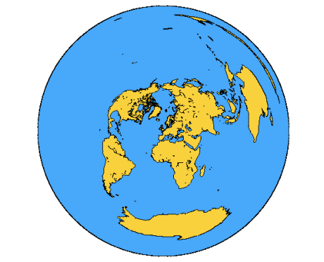
1) London, England.
Notice that if you start out due west from London, you will end up, not in Canada, but flying across Cuba and Mexico. To get to Japan, you need to travel across the Arctic Ocean and northern Siberia. Also note how huge Antarctica and Australia are compared to everywhere else, and if you look closely you will see an enormous narrow island taking up nearly 70 degrees from North to East – that land is New Zealand, on almost exactly the opposite side of the world to the UK.
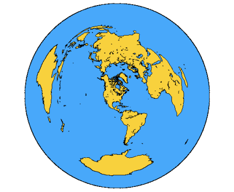
2) Chicago Illinois
This map shows that if you wish to travel from Chicago to Thailand, you need to cross over the North Pole, even though Thailand is close to the equator. It also indicates a considerably northerly path for Japan and China. To travel to Mozambique in southern Africa, you need to set out due East. Australia and Antarctica are enormous, again because they are furthermost from Chicago.
3) Sydney, Australia.
Look at how West Africa is distorted! West Africa is now gigantic compared to the rest of that continent, again owing to the fact that it is nearly on the other side of the world. The Iberian peninsula is similarly disfigured. To reach Chile, you need to travel South East, and traveling to parts of eastern Brazil requires a southern journey over the Antarctic ice cap.
4) Beijing, China
This is an interesting map. Most of the globe is recognisable and relatively well proportioned (OK Africa is a bit oversized, but we will ignore this). But look at South America! If you look closely, there is a ring of yellow encircling this map. Clearly the furthest point away from Beijing is in Argentina and as a result the mapping severely distorts the continent, The black lines are a bug that I can’t quite explain. In addition Hawaii looks a lot bigger than it should look, given it’s distance from China. I have a feeling that more gremlins are at work here.


Ooooh, cool! thanks for doing Sydney 🙂