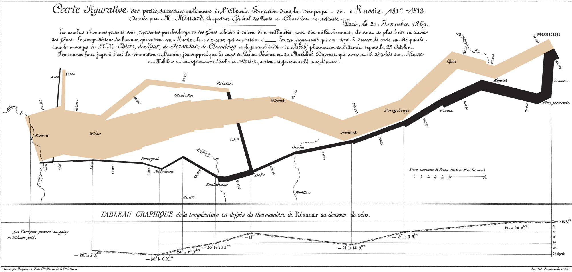
I’ve always been a sucker for maps, so it’s no surprise that a diagram in a recent issue of the Economist got my mind-juices flowing. It shows in graphic detail Napoleon’s disastrous campaign into Russia: how an initial army of over 400,000 men got whittled down to a mere 10,000 desperate men over the course of the savage winter of 1812. This map is regarded by Edward Tufte as “the best statistical graphic ever drawn”.
In looking for more details about this graphic I came across an article about it on the Strange Maps blog, and I was hooked immediately. Recent entries contain gems such as Papua New Guinea as linguistic superpower, a caricature of Europe in 1870, and a Blonde map of Europe.
Also, as an aside, Truce mentioned an Edward Tufte book “Envisioning Information” to me some while back, that she recommended I read. What with this map and the Hans Rosling presentation capturing my imagination so recently, I’ve decided to buy the book on Amazon today.

I recall that Napoleon map from the classic book on graphical communication. Who was it by? What was it called? Damn!
Edward Tufte – “Visual Display of Quantitive Information”?
Er. Quantitative Information, even…
The map is called Napoleon’s March to Moscow, and it was created by Charles Joseph Minard (1781 – 1870). Edward Tufte published this map in The Visual Display of Quantitative Information. He is presenting it during his seminars as a “perhaps the best statistical graphics ever drawn”.
I attended the seminar few years ago, it is fascinating – and quite an eye opener. Highly recommended should Tufte ever visit your neck of the woods.
Also, you can also purchse the map here: http://www.edwardtufte.com/tufte/posters
I hadn’t seen this one before, but I love it!
And I have come across yet another book with beautiful and fascinating visual presentations of ideas, too: “Arboretum” by David Byrne (I don’t know how to make a link in a comment, so here’s the address:)